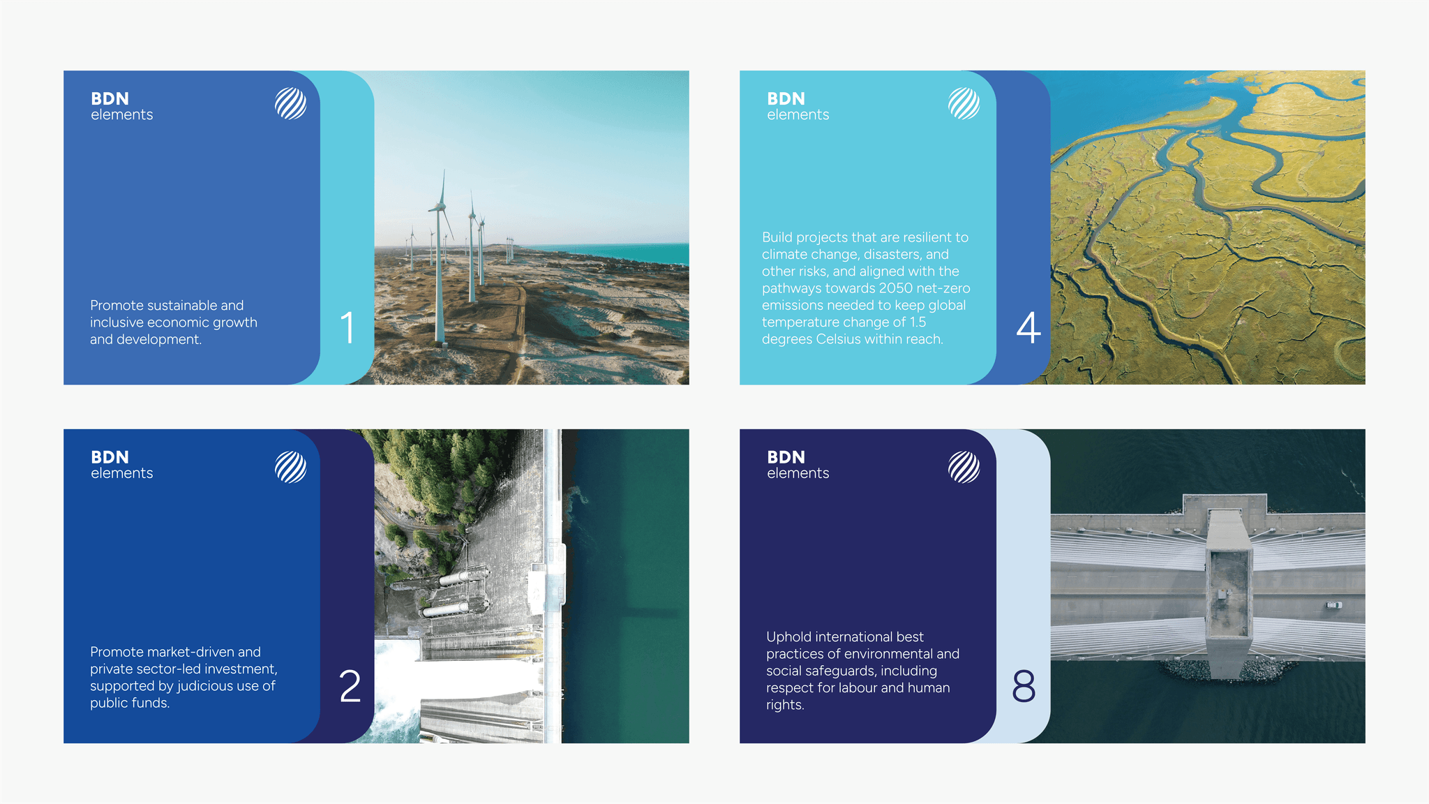
The Blue Dot Network
We created a visual identity and website, branded materials, and a certification mark. It is designed to be recognisable as a universal symbol of quality in infrastructure projects of different scales across the world.


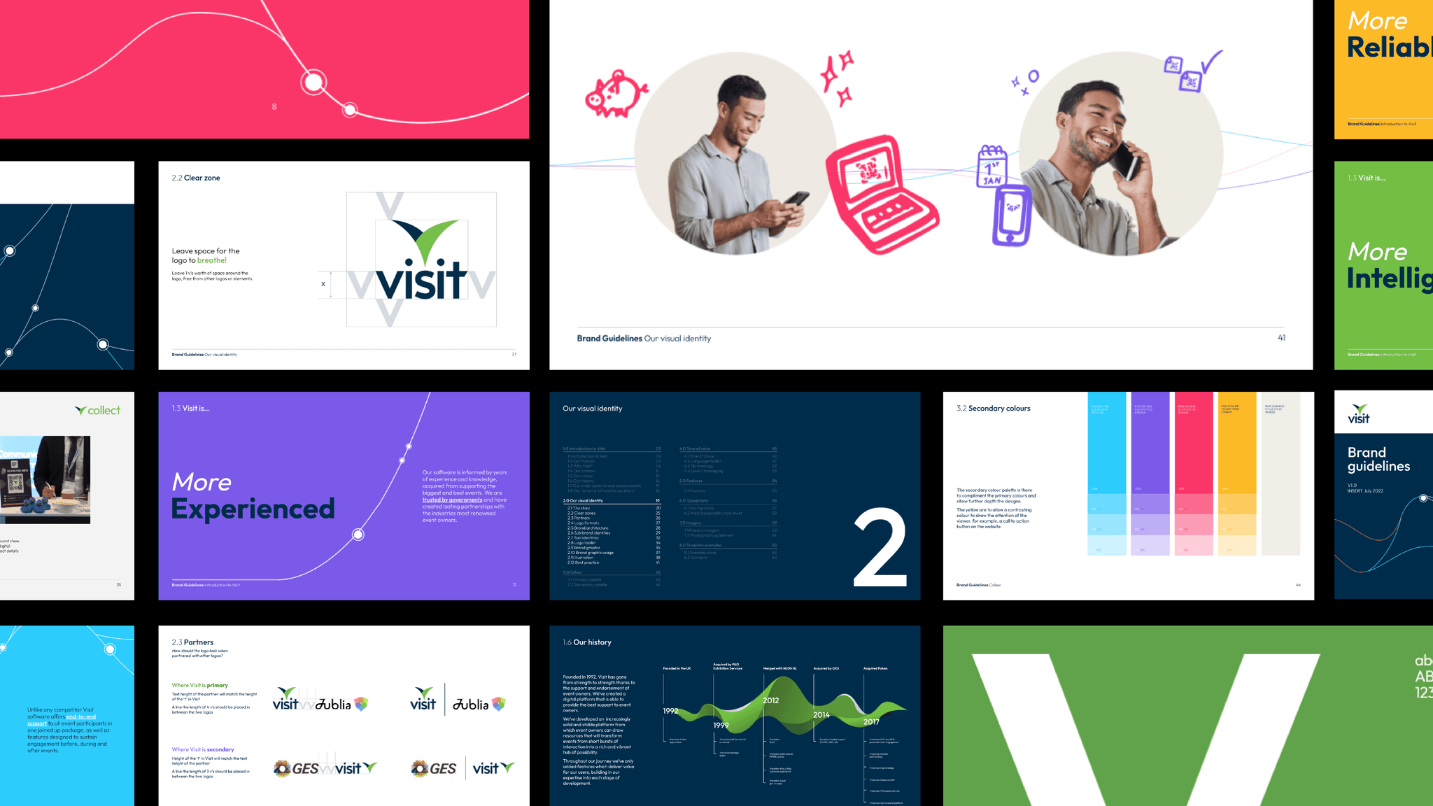
Visit
An events management platform to build communities. Visit wanted to strategically reposition their brand against a number of business goals and communication objectives. We created an extensive system and brand architecture to account for current and future needs, as well as a toolkit of assets for messaging that targeted the motivations of users


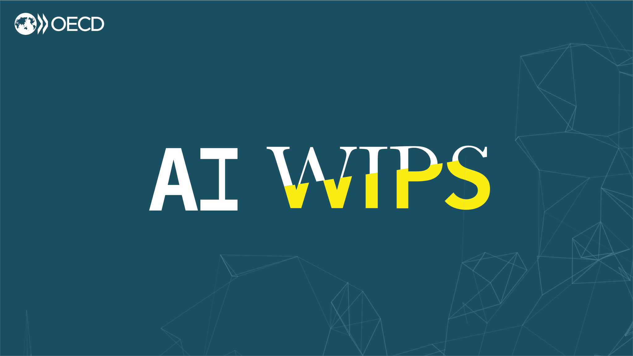
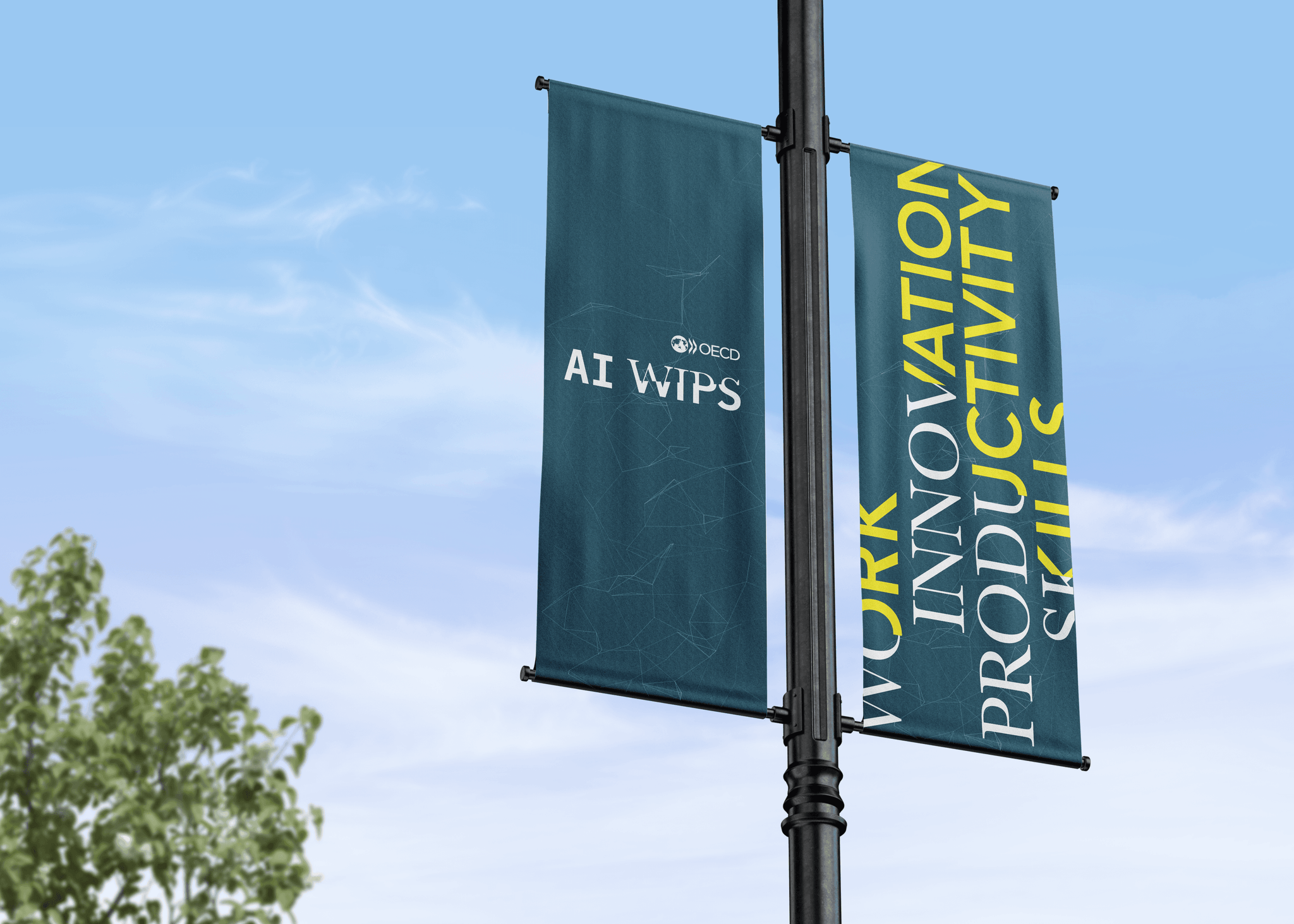
OECD AI WIPS
Branding for OECD's international conference on AI in Work, Innovation, Productivity and Skills. Using the versatile power of typography to reflect the impact of AI technologies on the world of work. Events needs a striking and memorable visual style effective across a wide variety of conference materials and formats, both physical and digital


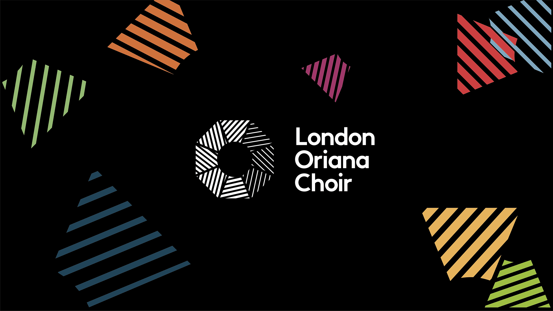
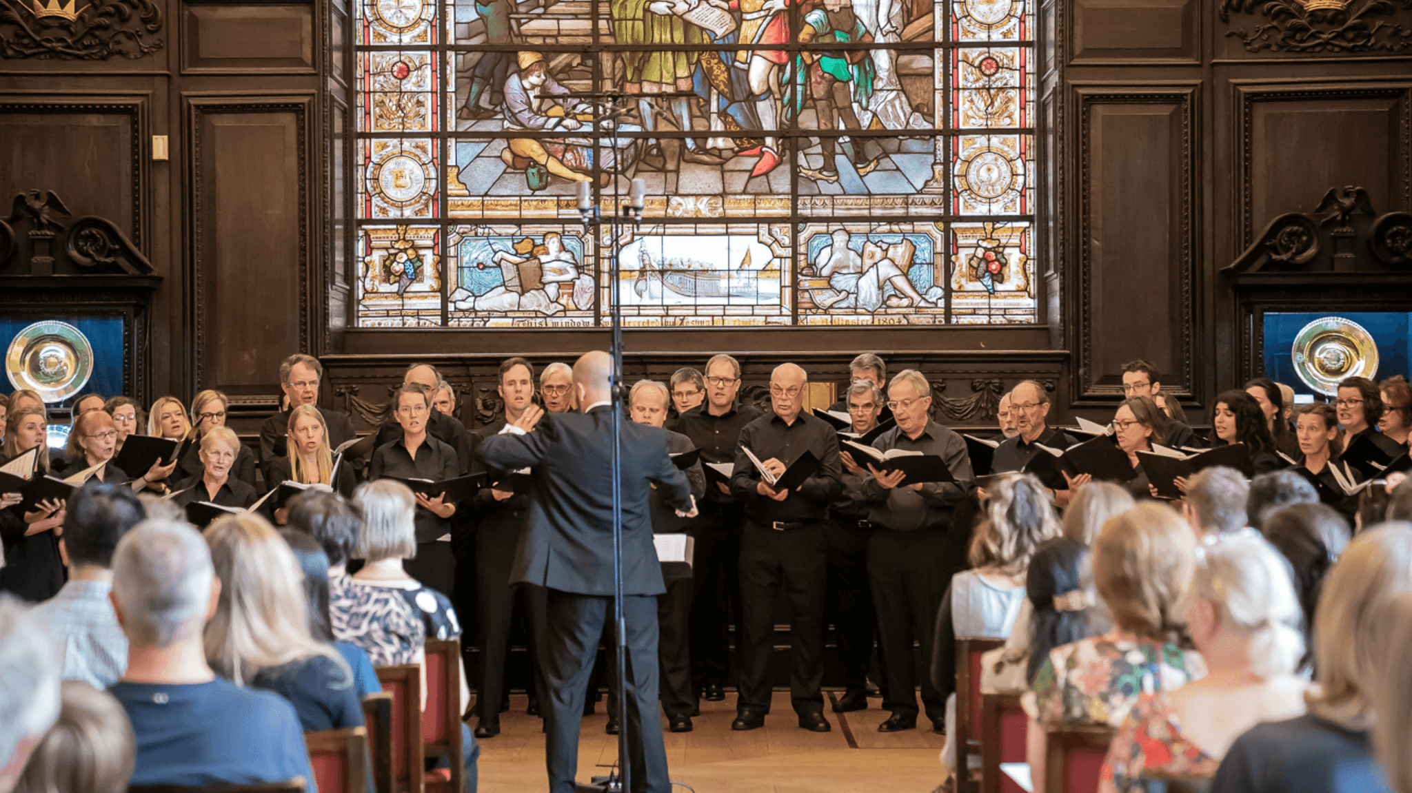
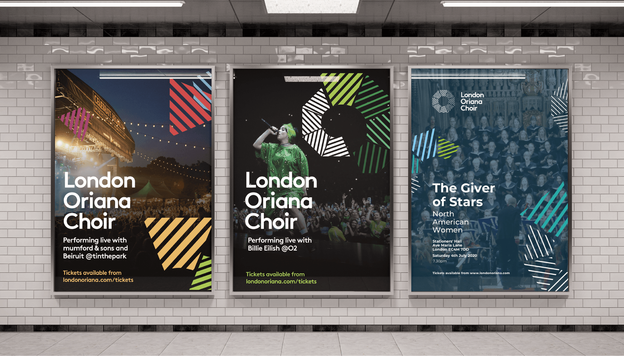
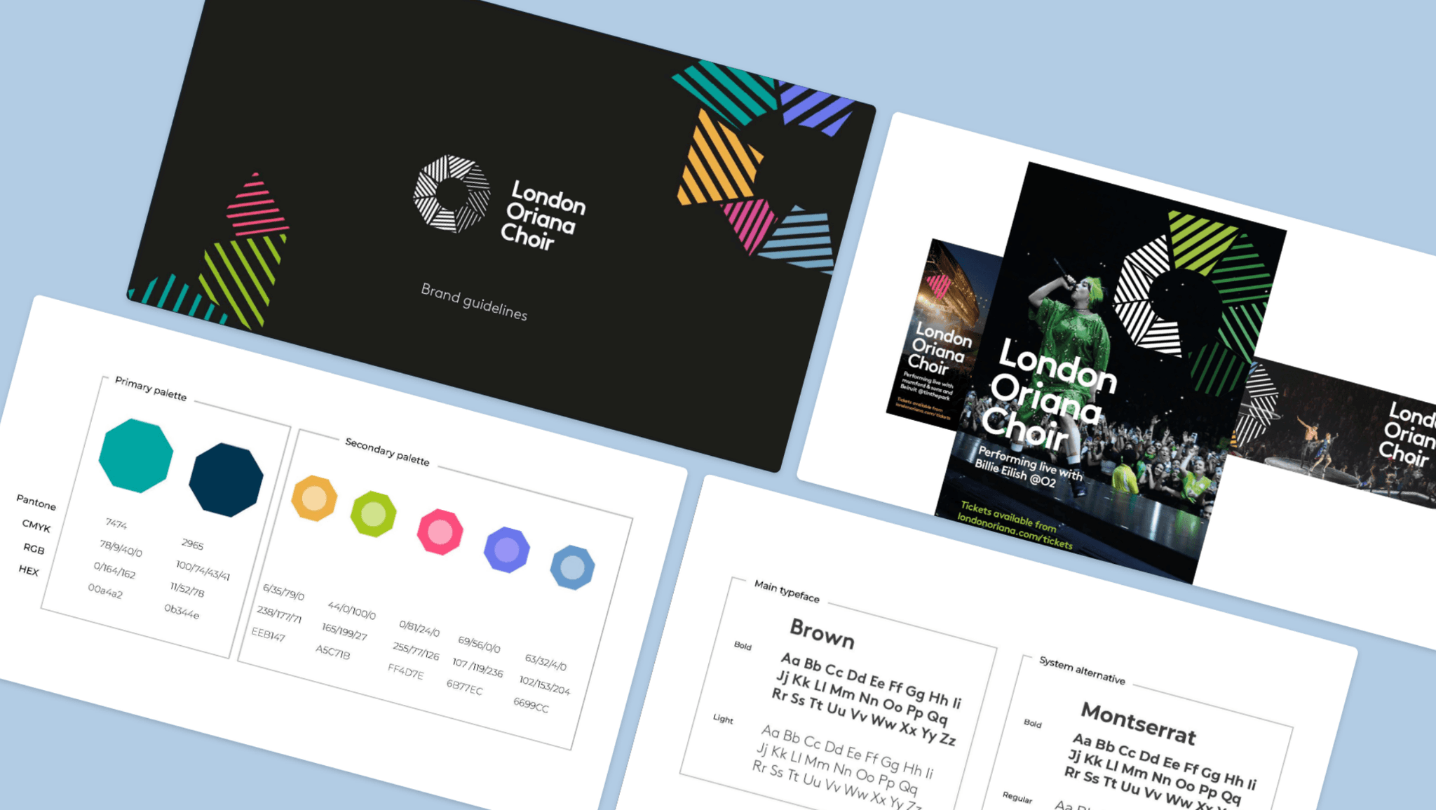
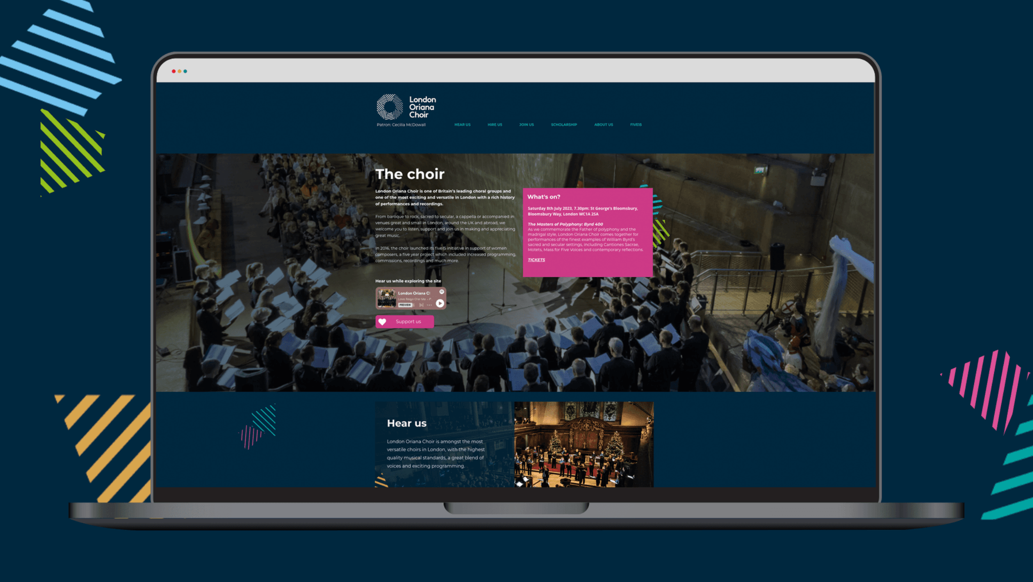
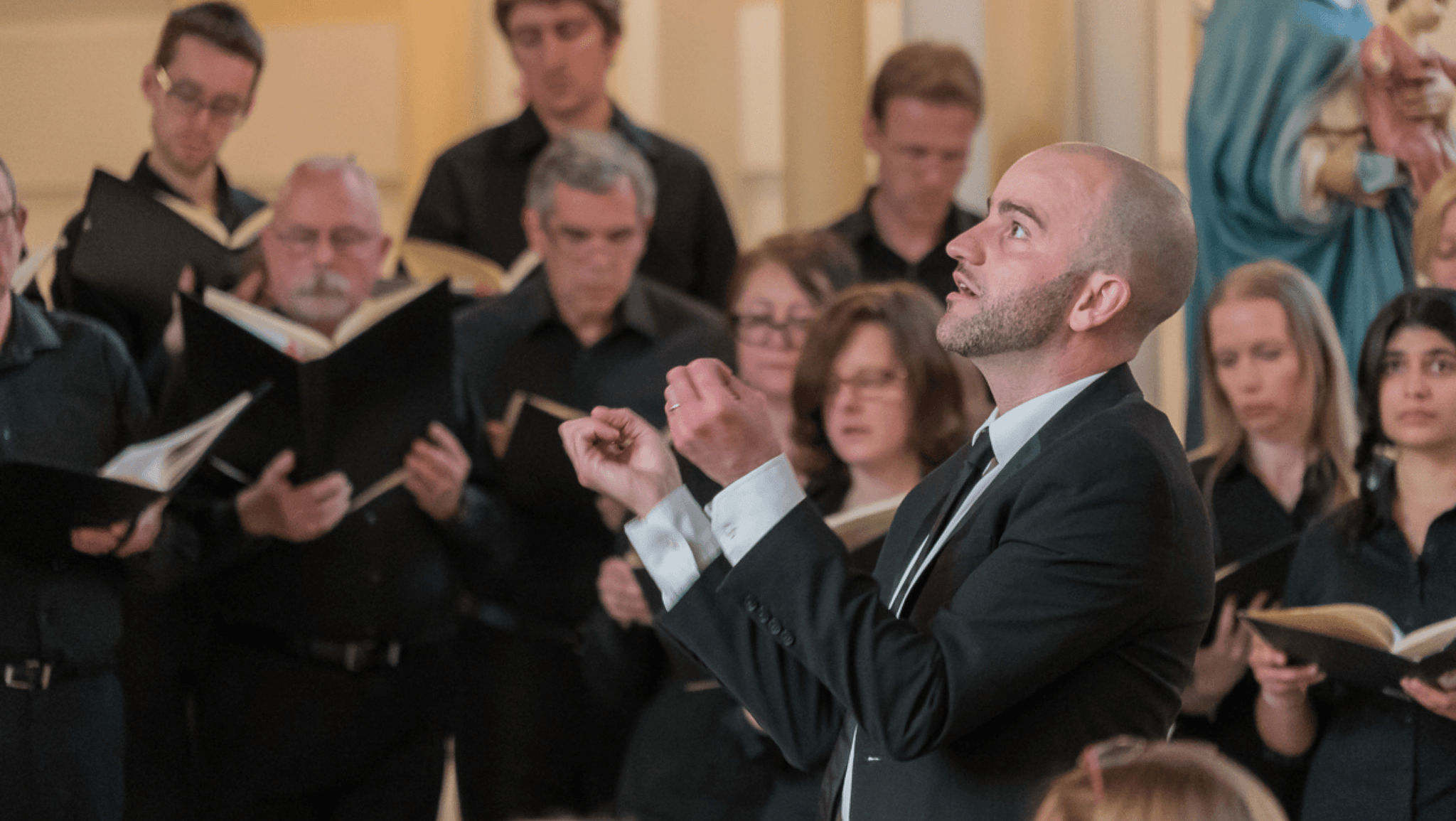
London Oriana Choir
Rebranding London’s most versatile choir. Oriana’s repetoire spans contemporary pop music, to early classical music, and everything in-between. The identity needed to be flexible enough to reflect these very different contexts

Audible identity – turn your sound on!
Audible identity – turn your sound on!
Origins of the identity
We wanted the immediacy of an ’O’ and a ’C’ to come through in the identity. The segments forming the appearance of an audience and choir. Choral music is typically written in eight part harmony, with two melodic lines across each of the four voices: Soprano, Alto, Tennor and Bass, with inspiration from the lines of the stave, on which music is notated were all the visual cues we needed to create this timeless identity
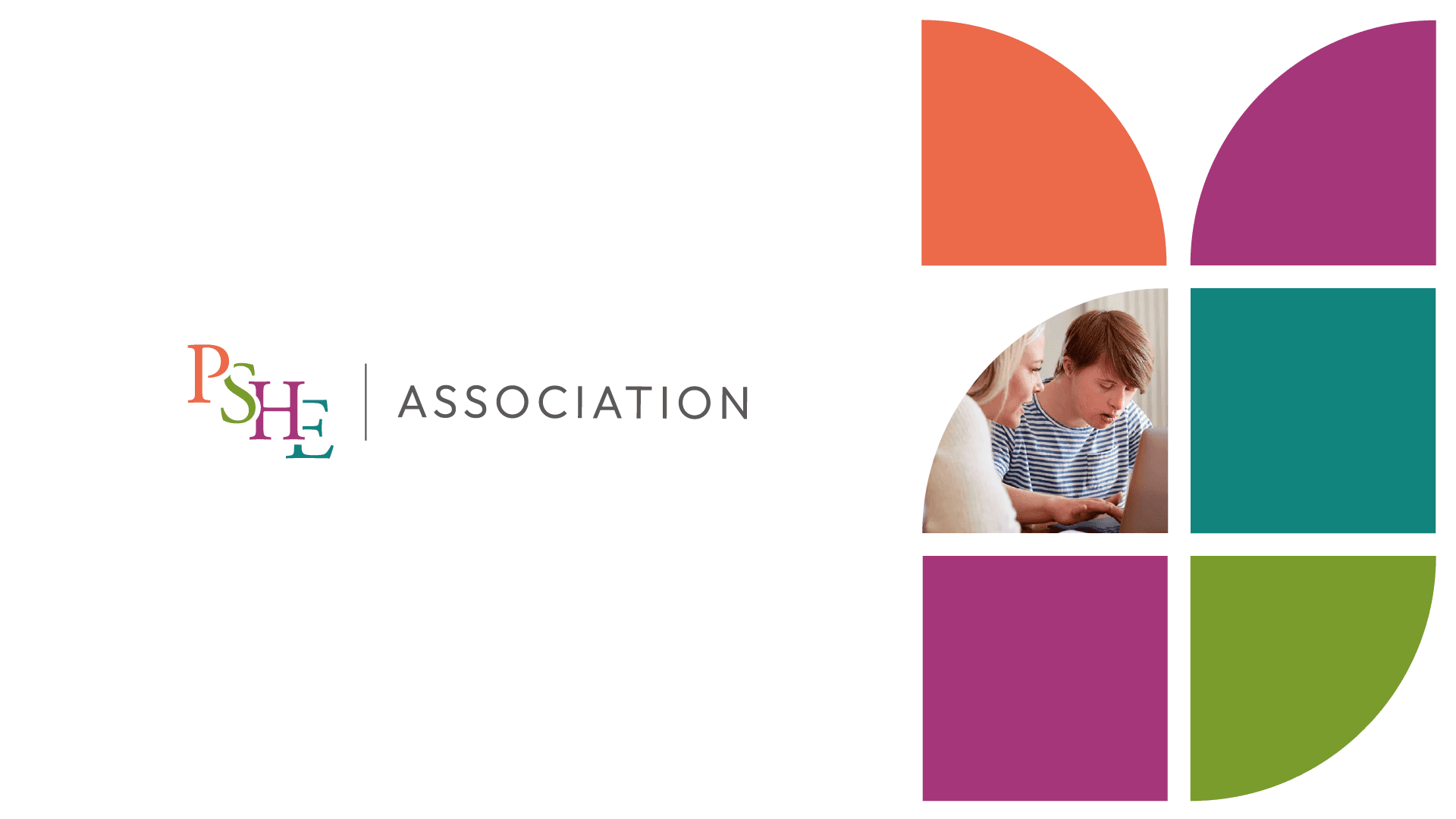
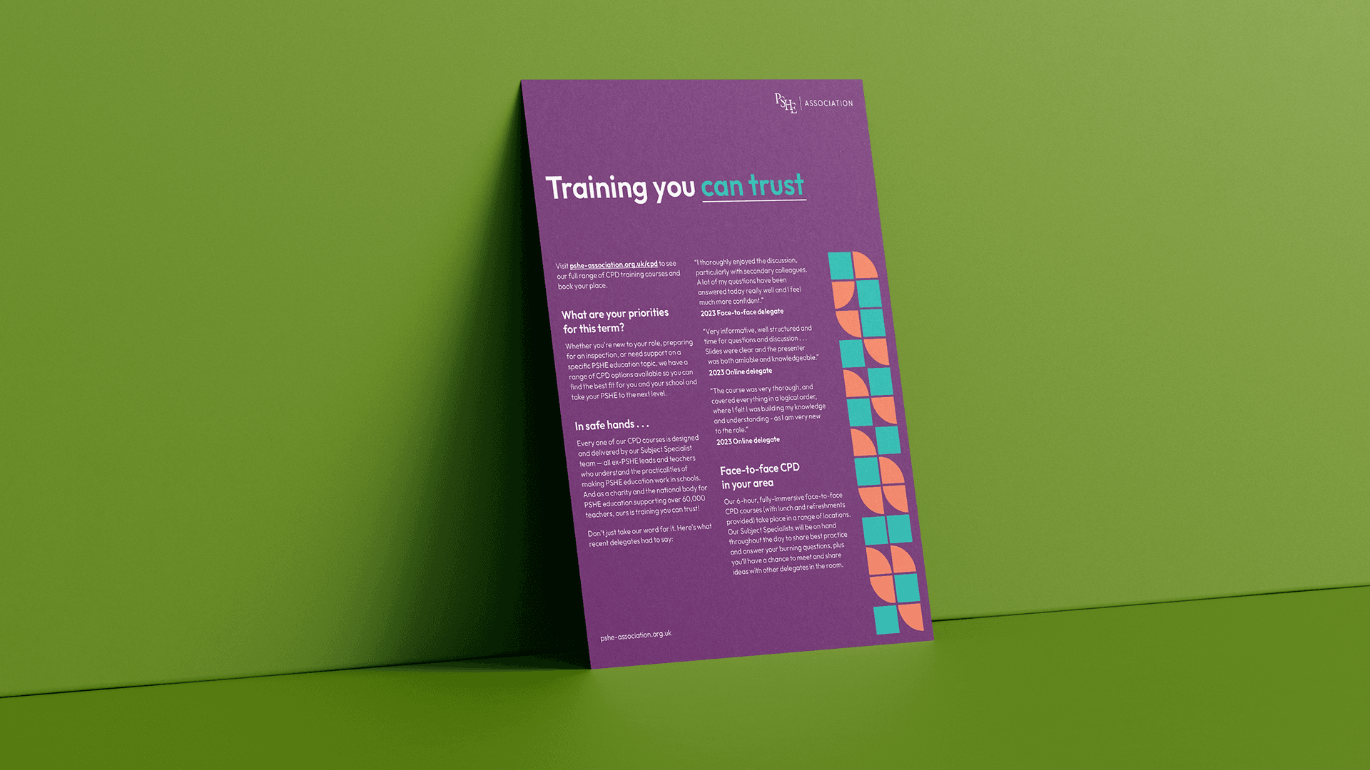
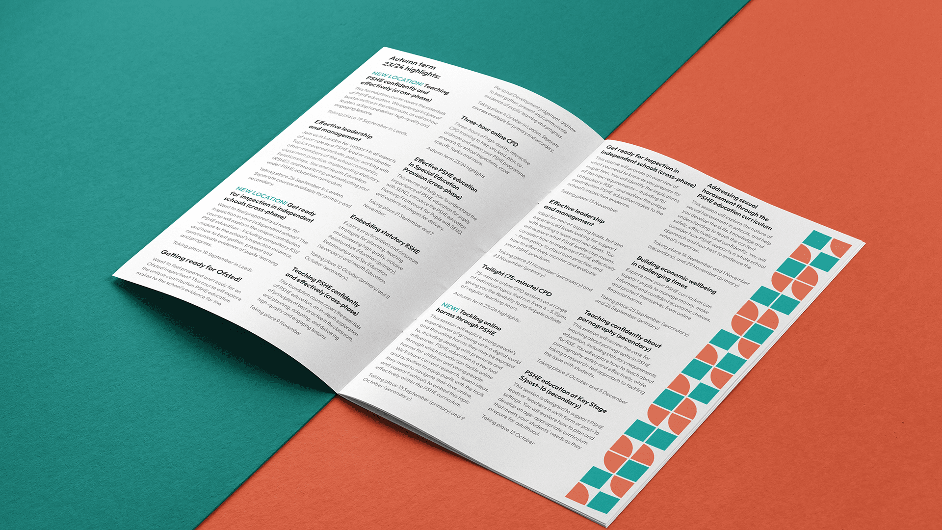
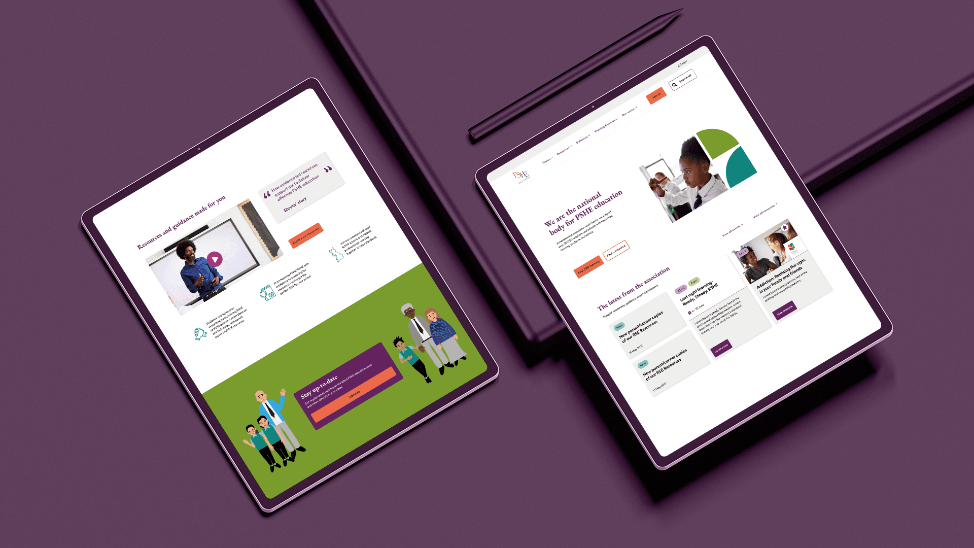
PSHE Association
Re-branding the national body for PSHE education in the UK. Our work included a quality assurance seal to denote their unparalleled, high-quality teaching materials. The work extends to branded collateral and templates for external materials as well as specific teacher and pupil-facing resources for lessons, and an accessible attractive website redesign

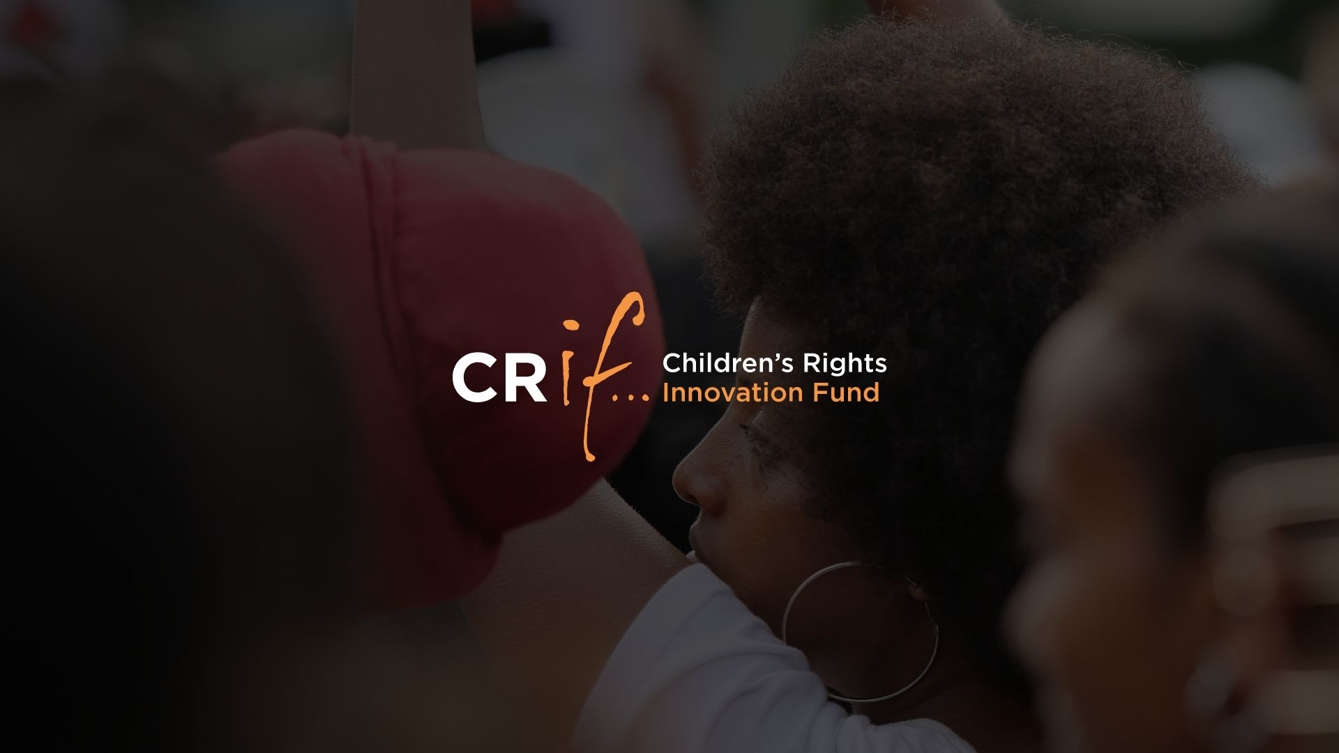
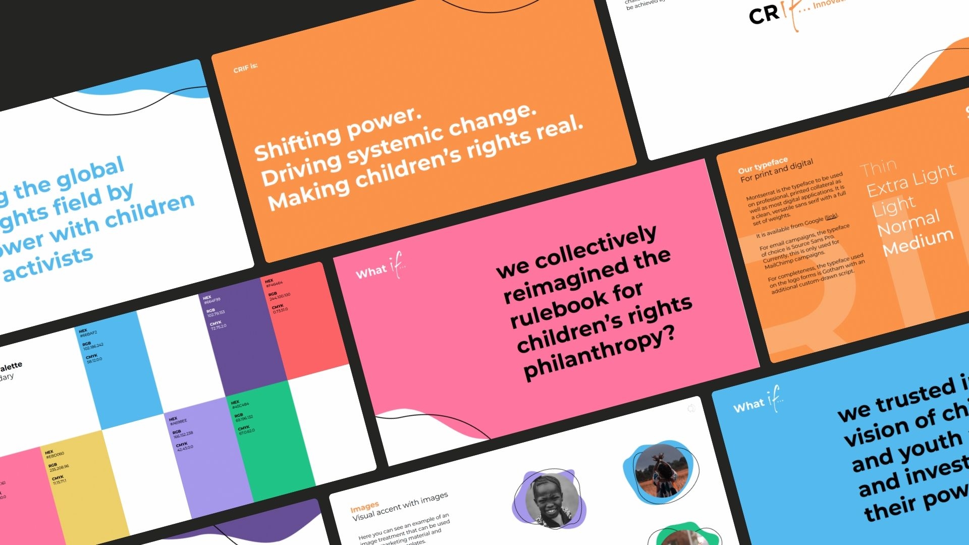
Children's Rights Innovation Fund
Children's Rights Innovation Fund. CRIF needed a brand that matched their disruptive approach and their belief in the need for innovation in the childrens' rights space. Our idea was to give them a device that would never get old. Asking questions is where new ideas begin, and the status quo is challenged. The opportunity to use the 'if' of CRIF was too good to ignore


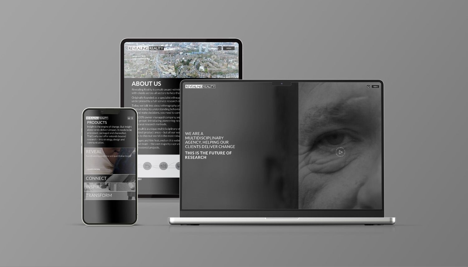
Revealing Reality
Branding an award-winning research and insight agency with a unique qualitative offering. Their work answers their clients’ most complex challenges by revealing reality, uncovering behaviour and context
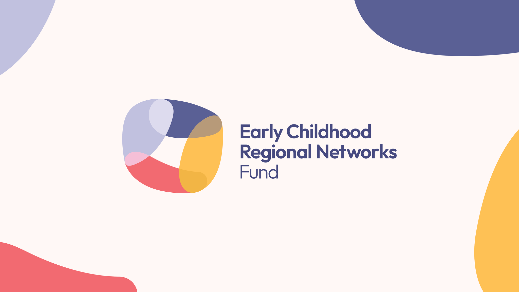
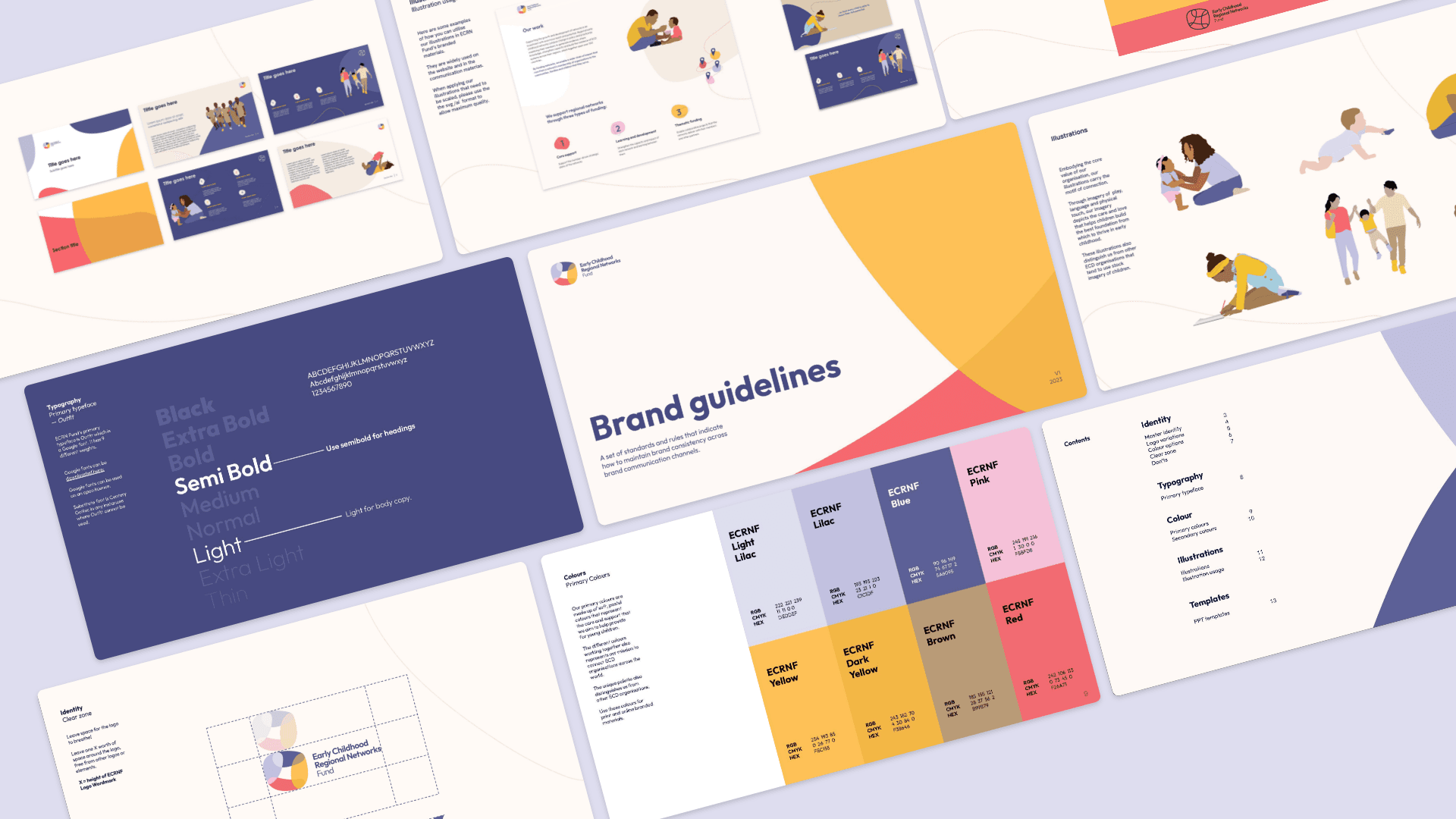
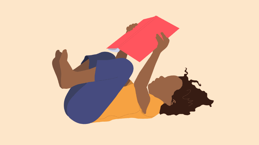
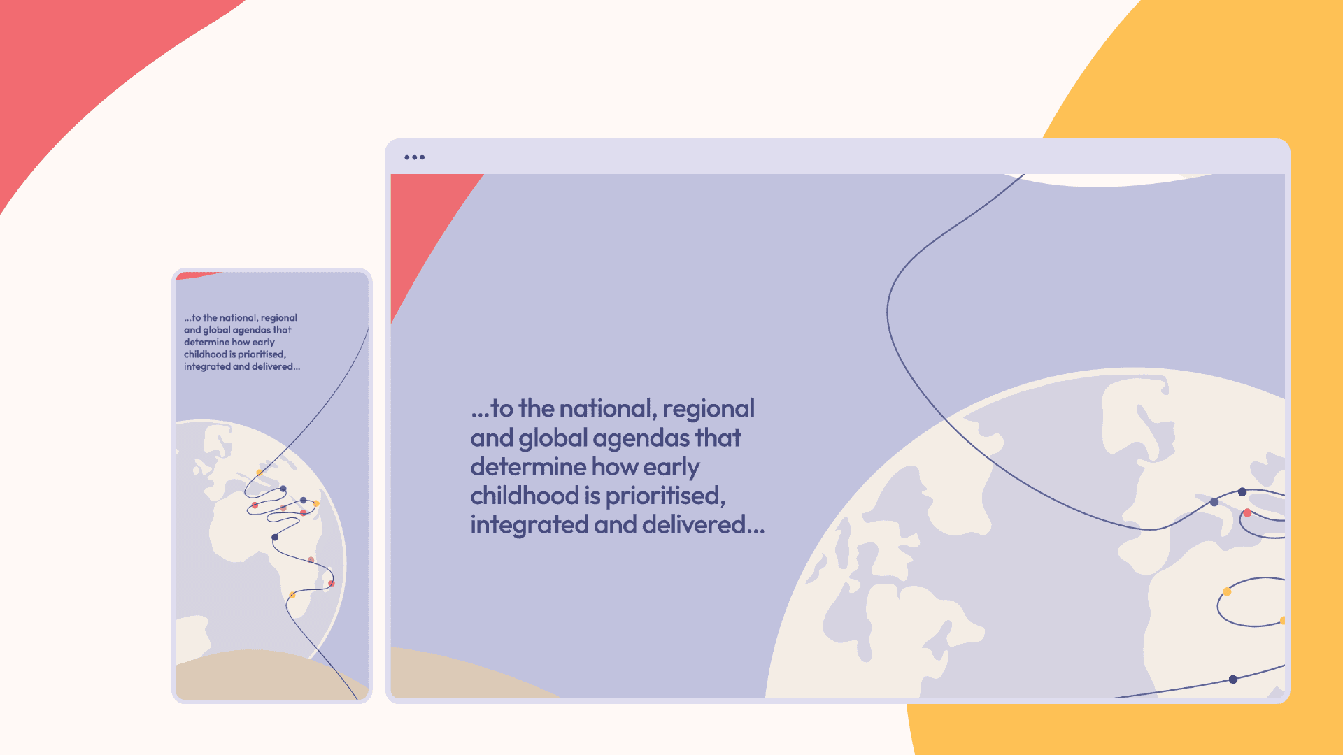
Early Childhood Regional Networks Fund
An intermediary fund bringing together and coordinating four regional groups. We create coherent, accessible brand systems to empower organisations big and small with the tools needed to create great communication outputs with or without our ongoing help and support

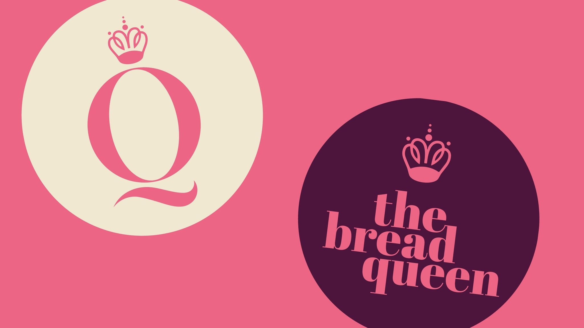
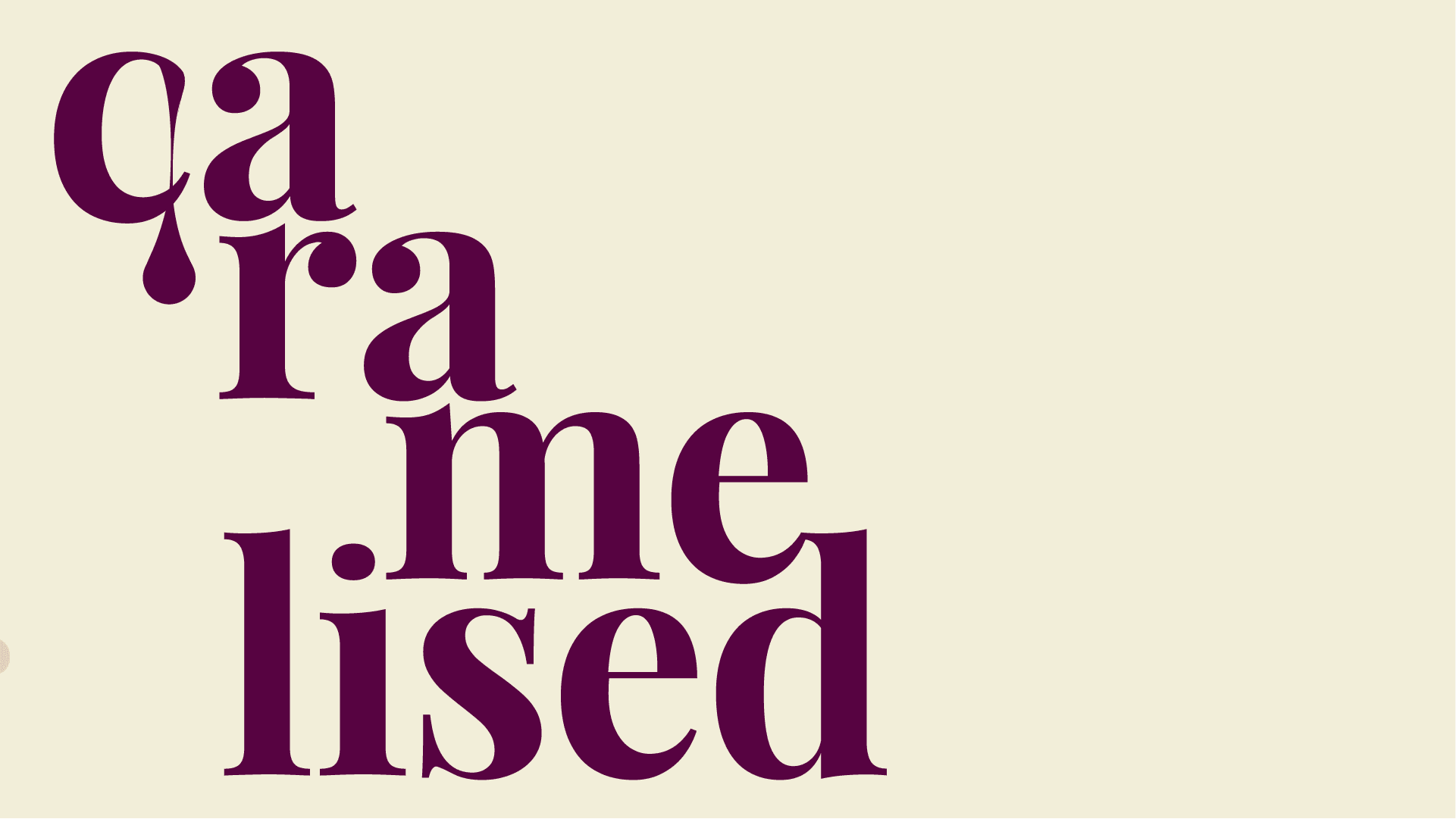
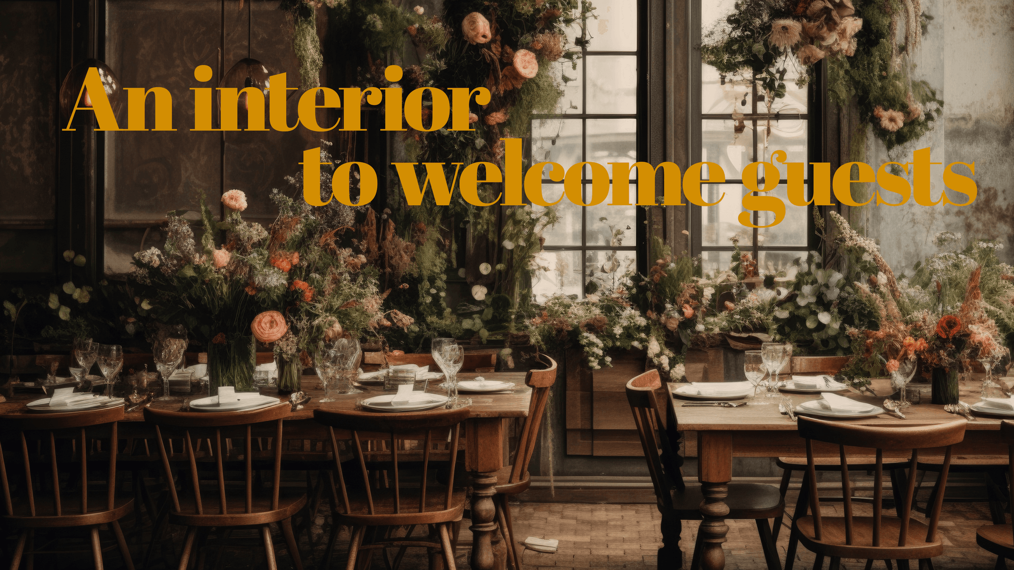
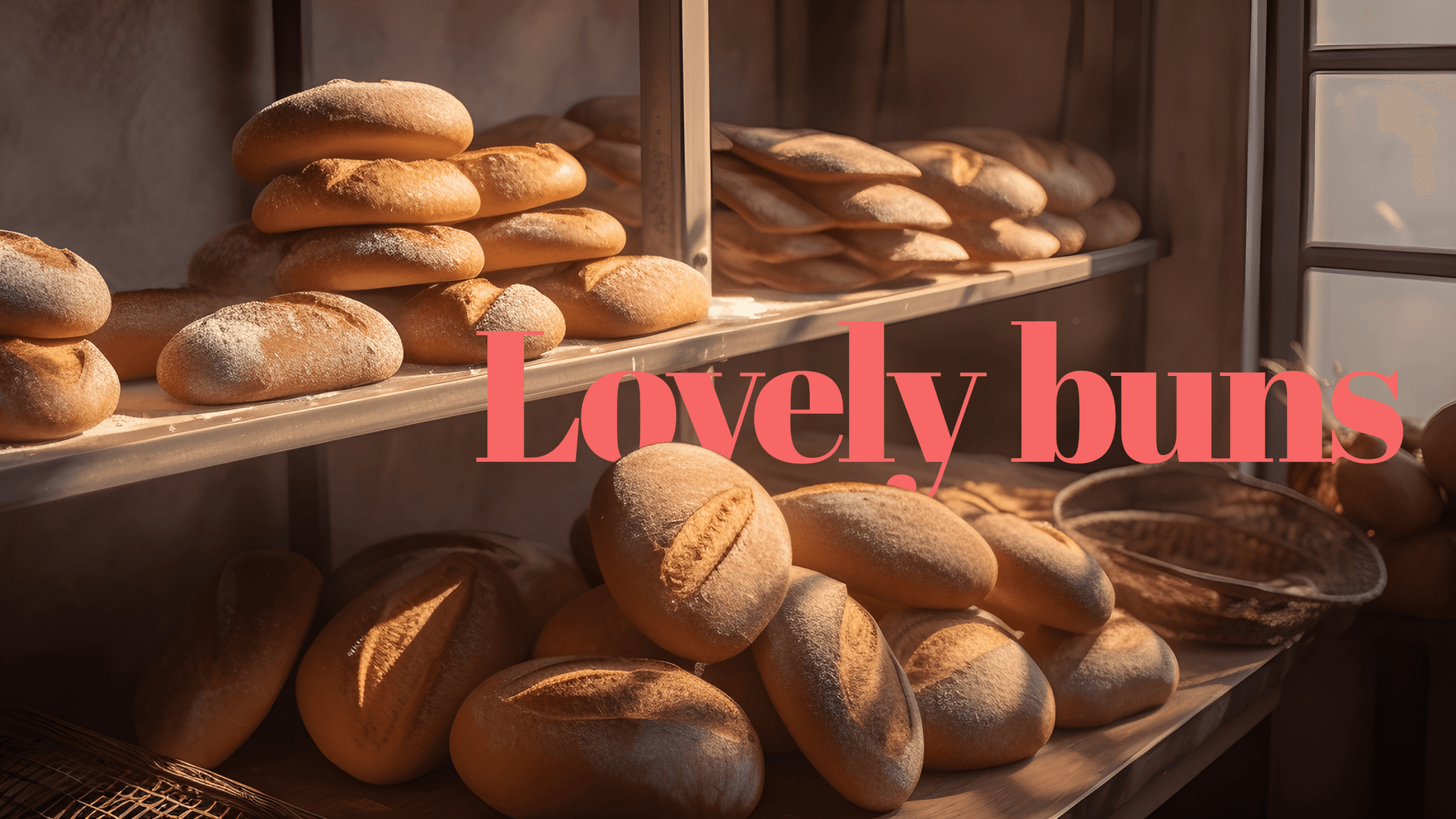
The Bread Queen
Branding for a boutique cafe chain and online bakery retailer. Designed to cover all customer touchpoints. Using typography to create an evocative, enticing brand for hungry customers


Inhouse Plus
Brand website and promotional collateral for high-end architecture and interior design firm


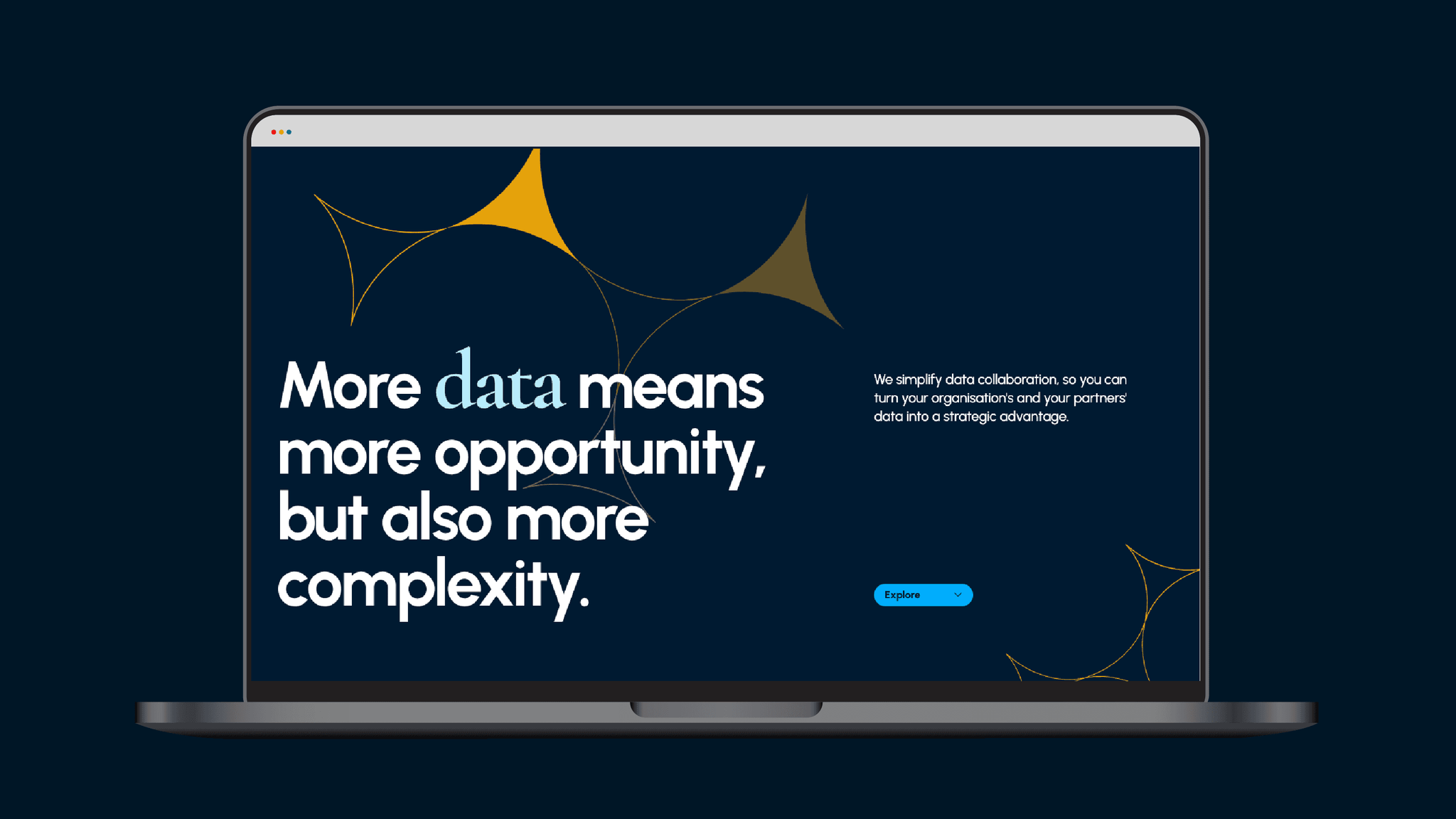
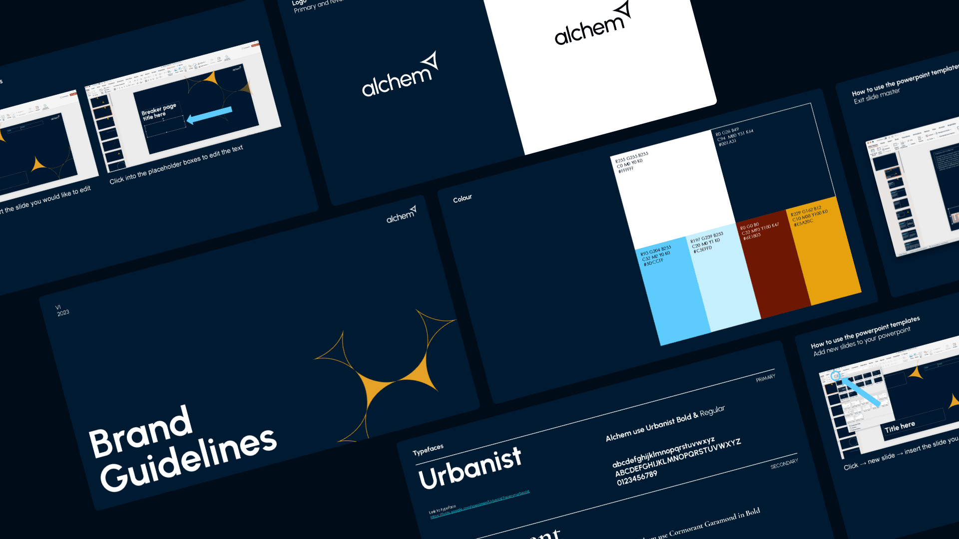
Alchem
Brand and online presence for innovative tech start up, helping organisations collaborate and share data securely across boundaries
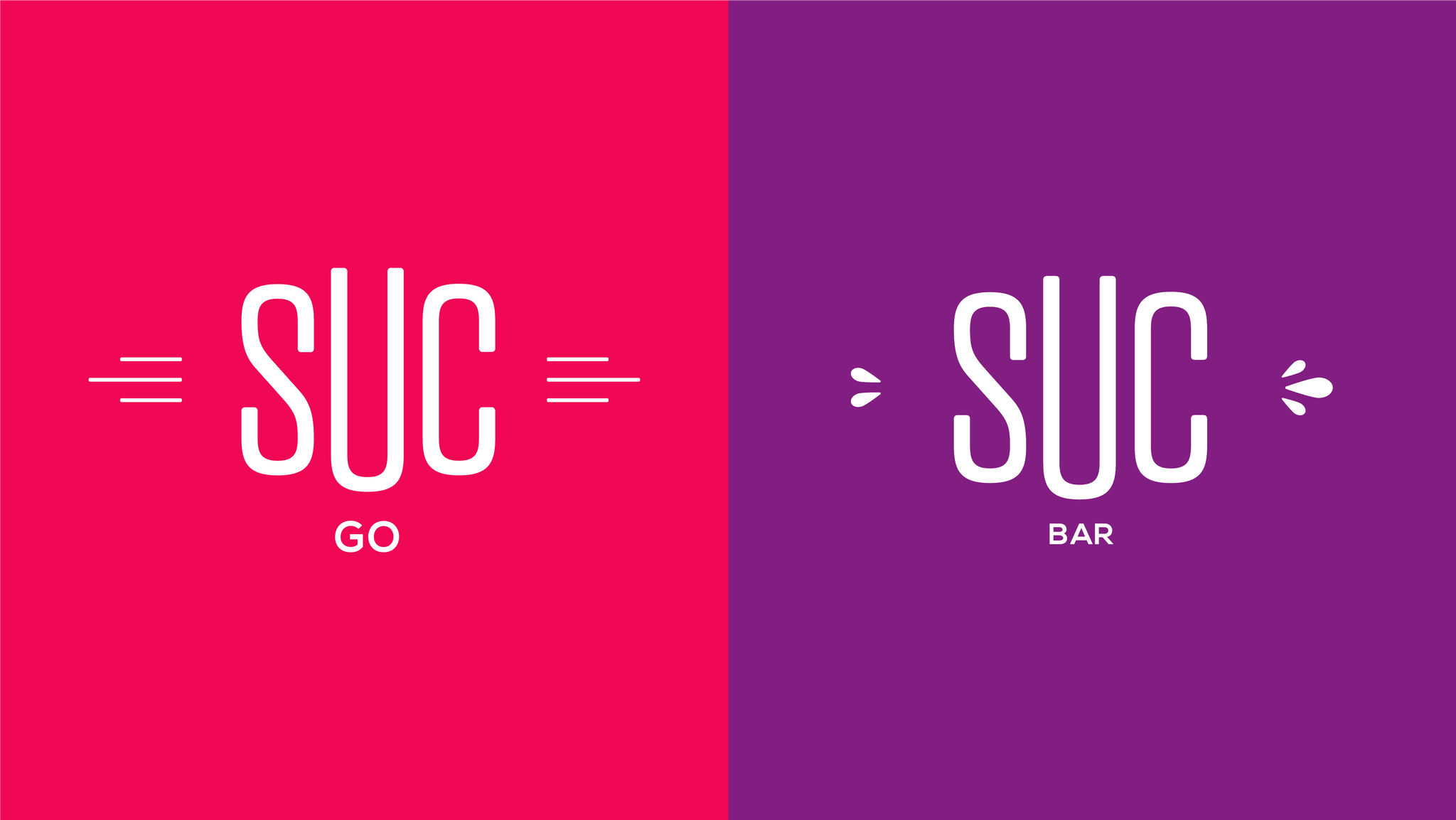
SUC
A suite of brands for a high-end Swiss food and drink outlets. The retailer’s outlets and product lines were split into two concepts for different locations and customer needs. Online e-commerce and CMS website supported with social media content and management created an online offering for business customers


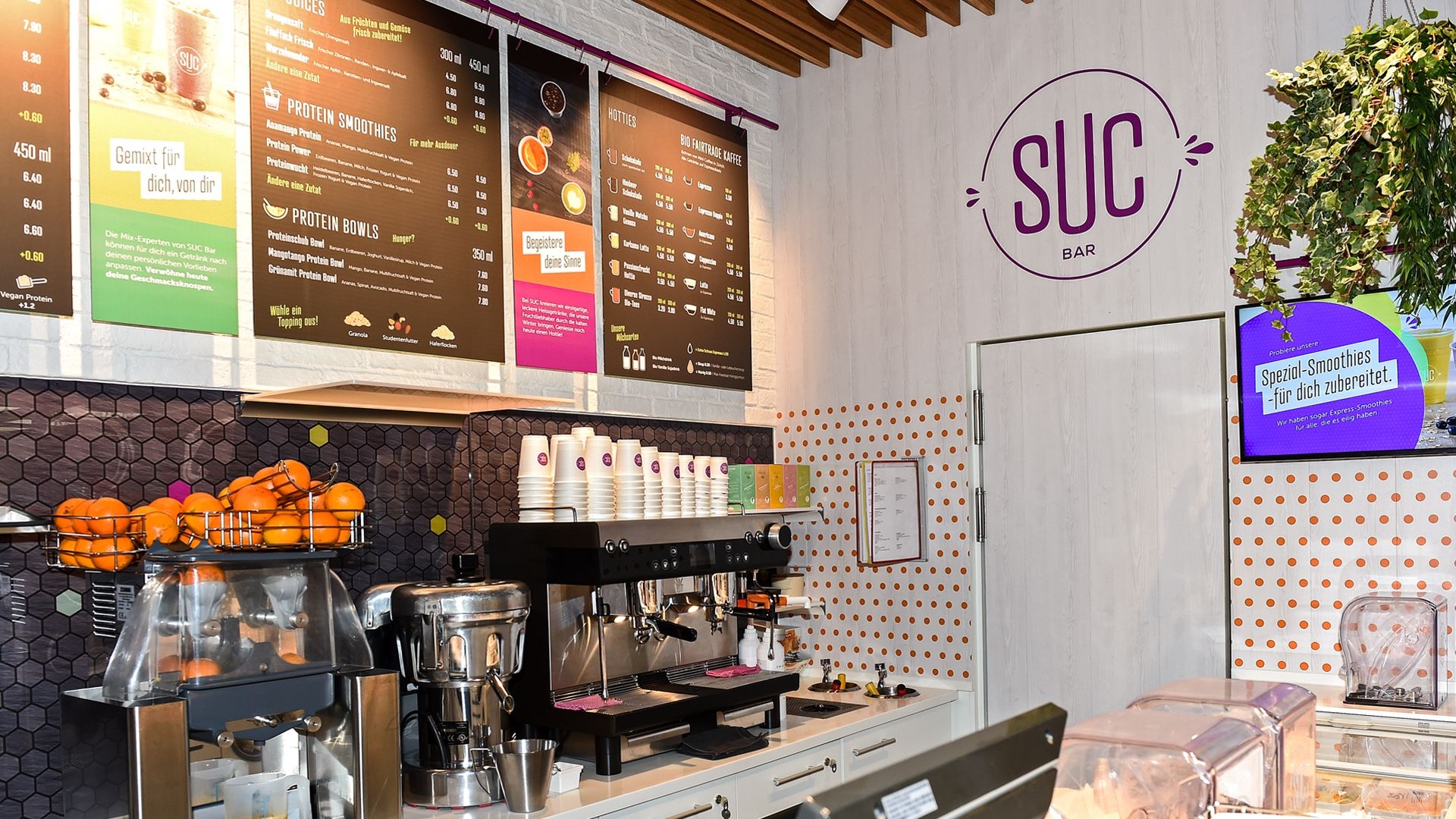
Interiors & Surfaces
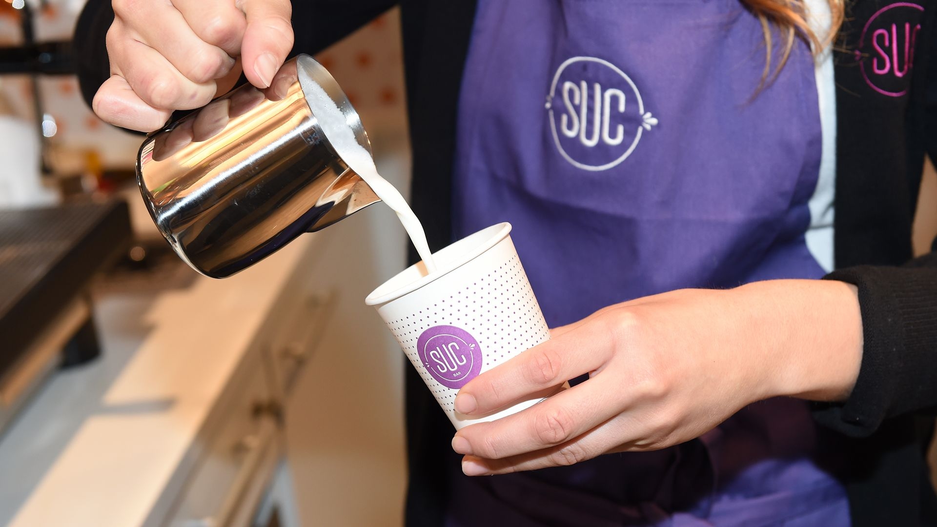
Uniforms & Photography
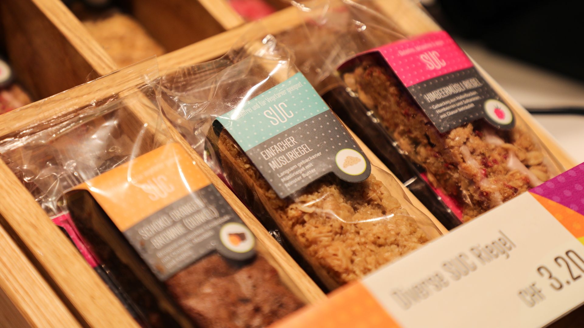
Packaging & Products
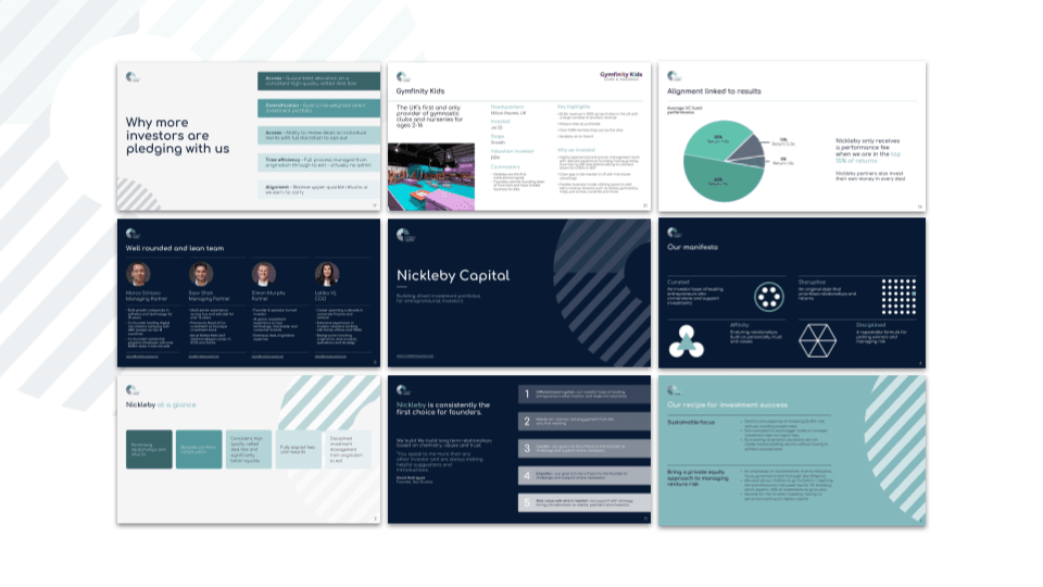
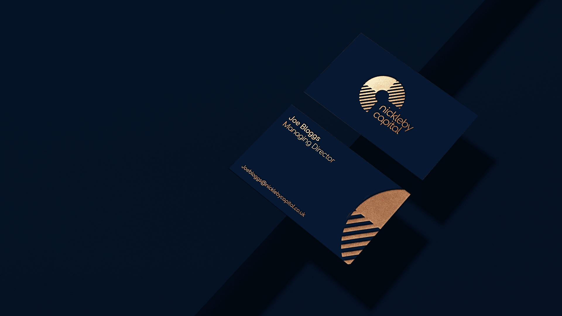
Nickleby Capital
Brand and website for private investment office creating direct investment portfolios for entrepreneurial investors